Monday 26 January 2015

What we did today - Flat Plans

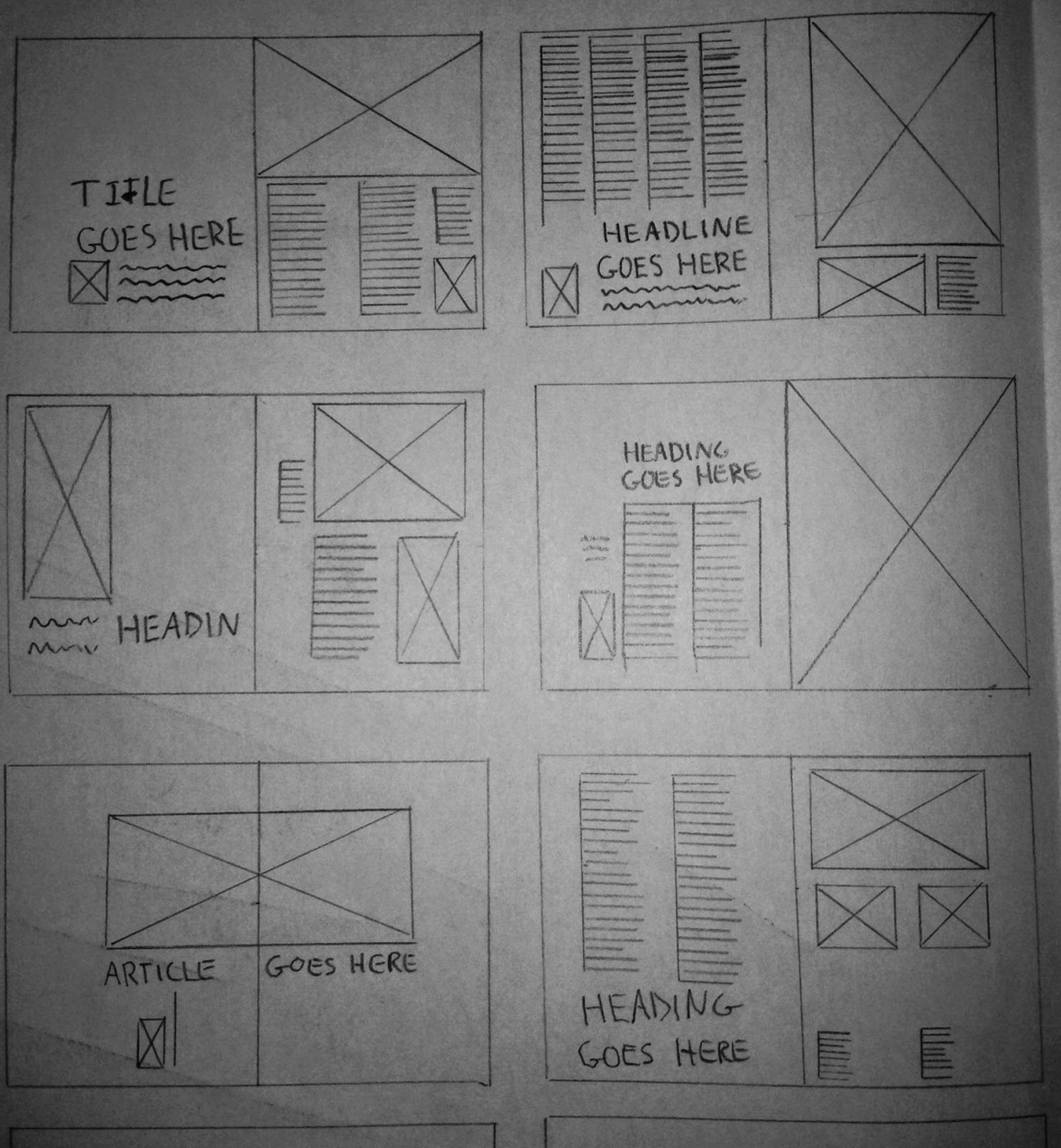
Double Page Spread - Layouts

Today we created page layouts for our magazines. This was necessary so we have a basic idea of how to set out double page spreads when it comes to creating our draft magazines. Below are 12 different layouts for a double page spread that I drew free hand - the big boxes with the crosses represent images and the lines represent text. 


Sunday 25 January 2015

Research: Institution that would publish my magazine

Vice Media, Inc. 

Vice Media, Inc, better known as just 'Vice', is a youth media company and digital content creation studio. It owns and publishes magazines such as Vice and i-D. It is famous for its strong ties with youth culture and the alternative scene which make it the perfect institution to publish my magazine as Oscillate is aimed 16-25 year olds and the alt crowd. 

Vice was founded in 1994 by Shane Smith and Gavin Mclnnes and now runs a network of digital channels across the globe. This network covers everything from world news to fashion and to music. Vice currently operates a music channel called 'Noisey' which caters to the alt scene and provides a platform for artists to express their creative freedom. However unlike i-D it is not in magazine form. my magazine would be the Noisey equivalent of a vice music magazine. 


Audience Research

UK tribes


According the research that I conducted on UK tribes, 'hipsters' are a social group which would be drawn to my magazine as they are apparently 'epitomised by vice magazine', which my magazine draws inspiration from. Due to similarity between the fashion implemented by my magazine and magazines like i-D, this also means that there are similarities in our magazines audiences.

"Like the 60s Mods and Rockers and the 70s Punks, Hipsters are as ubiquitous as Chavs in their role defining UK youth culture in the 2000s...

Epitomised by Vice magazine, rampant trend-chasing and getting absolutely wasted, Hipsters are increasingly the most detested Tribe in the UK. Most likely to be used as a term of derision, Hipster is associated with lacking substance, arrogance, being unoriginal – and more often than not, with being a white middle-class uni student. Calling someone a Hipster may now be a mockery, but whichever way you cut it, the ‘Hipster look’ has definitely come to dominate the high street.

The Hipster look draws from punk rock and the 90s with a splatting of bygone subcultures for inspiration. From Soviet prison culture to Grunge, the Beatniks or ‘white trash’ chic – these disparate influences mean the Hipsters have driven millennial youth fashion trends more than any other Tribe. From skinny jeans to the vintage/retro revolution, acid bright colours to animal prints, Aztec print and dip-dye hair – Urban Outfitters brings off-the-shelf Hipster living to the Trendies. Hipsters popularised fixie bikes, grandma specs, made Lomography and Holga cameras a regular on teen Christmas lists – Red Stripe became the summer drink of choice, Ketamine the drug, and minimal tech the sound.

With so much influence, what’s our problem with these kids? Christian Lorentzen writes that Hipsters ‘fetishize the authentic and regurgitate it with a winking inauthenticity’ and this arrogance and try-hard nature really gets up the back of a generation proud of ‘keeping it real’. Hipsters’ break-neck turnover through fads (and huge spending power to support it) mean they are seen as lacking substance in real meaning by older Tribes, while younger teens recreate their super cool look and lifestyle in Claire’s Accessories. Is it fair for Hipsters to get such a bashing, while the close-by Trendies get by without a scratch?"

YOU GOV


The audience for my media product based on audience research would be hipsters and young alts aged from 18 - 25. According to audience research conducted on YouGov UK, the type of person typically interested in alt artists such as FKA twigs and King Krule are male aged 18 - 24, live in London and are interested in art, culture and fashion. For this reason my magazine fits this target audience perfectly as my magazine adopts a graphological and fashion style that’s popular amongst that scene. I also previously stated in my research and planning that I wished for my magazine to be published in London and Tokyo primarily, so this works well seeing as my target audience primarily live in London.


Friday 23 January 2015

Research - Style Associated with Genre of Magazine

High Fashion/Street Fashion 


Because my magazine is aimed at a relatively young audience (16-25) and is aimed at the alternative scene, high fashion and street fashion would be the appropriate kind of style to implement within my magazine to appease my target audience. This type of fashion is also heavily associated with youth culture, which fits with my magazine perfectly.

Street style can trace its roots to Tokyo, London and NYC where street culture thrives. Street fashion is heavily brand orientated, with Stussy, Adidas, Supreme and Bape being among the most popular labels. Shops such as Urban Outfitters, Size? and Wellgosh are well known shops which are popular among the urban fashion scene as they sell the necessary brands.

Below is a list of some brands associated with street fashion:


Bape

Bape, short for 'A Bathing Ape' is a Japanese street wear founded in 1993 from Kyoto City. Since it's founding, the brand has been popular among youth culture and street fashion. Alternative artists such as Yung Lean and Kanye West are known to wear the brand.
Adidas

Adidas is a german sports wear brand. Arguably it is one of the most well known clothing brands in the world. Despite this, adidas remains popular within street culture and has almost become a staple.


Y-3

Y-3 is a collaboration effort between Japanese fashion designer Yohji Yamamoto and Adidas. It's essentially the high end fashion industry's answer to street style and is known for its avant-garde shoe design. With the release of it's Qasa shoe range, it's recently seen a surge in popularity with the street scene.


Comme des Garçons

Comme des Garçons (french for 'like the boys') is a Japanese fashion label founded in 1969. It's associated with high end fashion and is seen being on par with fashion labels such as Givenchy, Gucci and Yve Saint Lauren. However it's PLAY clothing line has become very popular with the street scene in recent years, with it's love heart logo being a popular symbol.
Supreme

Supreme is an American skateboarding clothing brand that was founded in NYC, 1994. It is well known for its bold logo and is particular popular for it's snapbacks and caps. It has collaborated with many other brands such as Comme des Garçons and Nike.


Stussy

Stussy is an American street-wear brand from Orange County in California. It was founded in 1983 and has since become a staple brand for street fashion. It's most popular for it's signature logo and t-shit designs.


Norse Projects

Norse Projects is Danish company from Copenhagen known for it's high quality and meticulously designed clothing. It was initially popular with the hipster scene however street fashion has recently adopted it into its style


High Fashion- Monotone // simplicity


A recent trend within high fashion is simplicity and monotone colour schemes. For my magazine, I will style my models in black and white coloured clothes to fit this trend. Below is a collage of style pictures associated with high fashion. As you can see, plain shirts, long overcoats and generally minimalistic clothing is what's most popular within high fashion at the moment. Because high fashion is easier to replicate, I will most likely be utilising this style within my magazine as opposed to just dressing my models in every street brand I can think of. The simplicity of high fashion also fits well with the way I plan to design my magazine (minimalistic & simplistic)


Wednesday 21 January 2015

Research: Photographers

Patrick Demarchelier 

Patrick Demarchelier is a french photographer who specialises in fashion photography. He usually sticks to a black and white colour scheme and normally takes mid shot style photos. His photos tend to look very simplistic and naturalistic as the model doesn't usually wear excessive makeup in his shots. The black and white colour scheme he sticks to further bolsters the simplistic nature of his photography.


Terry Richardson 

Terry Richardson is an American photographer who specializes in fashion and portrait photography. He has worked for famous magazines such as i-D, Vogue and the Rolling stone and is known for his shot of the campaigns of famous brands such as Marc Jacobs, Supreme and Yves Saint Lauren. His photos tend to be fairly risqué and are very washed out, making the image appear very blank colour wise. 


Juergen Teller

Peter Lindbergh is a german photographer who again specialises in fashion photography. His photos are fairly colourful and are also naturalistic. However he seems to prefer to take his photos in naturalistic settings as opposed to taking them in front of white screens.

Research: Analysis of Langauge Register in New Music Magazines

Most new music magazines display appropriate manipulation of language register in order to appease their audience, for example, the music magazine Kerrang writes with an informal style (low register) to engage their target audience which tends to be teenagers/young adults. However other magazines such as The Wire utilize a high register when writing their articles as their target audience tends to be adults. When writing articles for my magazine I will use a medium register as the genre I've chosen (Alternative, Indie) is typically listened to by a young adult audience. An example of a magazine that also uses a medium register is The Fader, as they have a target audience that is generally young adult/late teens.

squareLanguage register can be manipulated appropriately to suit a target audience by using specific language methods. These primarily include Lexis and Grammar. For example a text with low register usually uses a lexis comprised of slang to engage a younger audience. On the other hand a text with a high register would use a lexis consisting of many polysyllabic words and jargon. This is evident as magazines such as Kerrang use slang fairly frequently but The Wire doesn't, and uses jargon instead. Language register can further be manipulated by use of grammar. Texts with a high register use lots of complex sentences and use standard english grammar, however texts with low formality tend to use grammar more typically seen in conversation.  For my magazine I will use a mixture of slang, jargon and standard english grammar in order to achieve a medium register for my text.

Monday 19 January 2015

Analysis of Magazine Titles

The Wire

The Wire, more commonly known as just 'Wire' is a british music magazine thats main focus is on avant garde and experimental music. I believe it's title is effective as it almost represents the style of music that it features. By this I mean 'the word Wire' sounds almost like something that will give you an electric shock, almost like a live 'wire'. This suits the style of avant garde music that the magazine features as it's supposed to be shocking, edgy and different. The title is also effective as it's short and to the point as consist of only two syllables.

Dummy  

'Dummy' is a new music magazine which features mainly alternative and innovative pop music. I believe the title is effective because a dummy is something that is essentially a replica or model of something else. And seeing as pop music is generally about emulating popular styles of music, the word 'Dummy' is an appropriate title. Like the 'Wire' the title is also phonetically effective as it only consists of two syllables and is catchy.

NME

'NME' is a magazine that is mostly associated with Rock and Indie music. 'NME' is an abbreviation for 'New Musical Express', which works effectively seeing as New Musical Express would be far too long a title to put on the front of a magazine. Furthermore, 'NME' is just three syllables which makes it sound both phonetically pleasing and easy to remember.

Loud and Quiet 

This title is effective as it's oxymoronic and is therefore intriguing to potential new readers. By oxymoronic I mean that 'Loud' is opposite to 'Quiet' and therefore the title seems contradictory. However the title is actually quite fitting to the magazines purpose as it features new indie and rock musicians that produce good music but aren't particularly famous, hence 'Loud' and 'Quiet'.

Clash 

Clash is an example of another effective magazine title as it too suits the purpose of itself. Clash Magazine is an amalgamation of both music and fashion so therefore the title 'Clash' is fairly fitting. The word 'Clash' is also an example of onomatopoeia which is effective seeings as the magazine writes articles about music.

Research - Genre of Magazine

Alternative Music

For my magazine the genre of music I have chosen is anything that's alternative. This can range from from anything to alternative rock to alternative hip- hop to avant-garde music. Magazines such as Dummy, Dazed & Confused and i-D inspired me to take on this type of music genre for my magazine as they combine style and fashion with the best music to create their magazines. Choosing alternative music as my genre also gives me a lot of creative freedom when it comes to the design of my magazine as there's a huge amount of diversity within the alt music scene. 

Here are a few artists that fall under the alternative music umbrella that would appear on my magazine: 

King Krule


Archy Marshall (better known as King Krule) is a British musician and songwriter from London. His music style is a unique blend of indie rock, jazz and hip hop. His music generally sounds dark and bleak as he sings in a gritty voice about the hardships of living with depression and disillusionment. He's popular among the young alt scene and has appeared on magazines Dazed and i-D.


Danny Brown


Danny Brown is an American alternative hip hop artist from Detroit. He known for his hip hop music as it sounds different to most mainstream versions and adopts an alternative style. He has been featured on magazines such as The Fader and is popular among the alt crowd but recently has become more mainstream.


FKA twigs


FKA twigs (formally known as twigs) is a British song writer/musician from London. Her musical style is generally alternative R&B but is known for integrating experimental features into her music. She's highly popular among the alt crowd and has been on the cover of several magazines such as i-D and Fader. She has also worked on video projects with Dazed and Confused.


Die Antwoord


Die Antwoord are a South African duo from Cape Town. Their musical style consist of alternative hip-hop/rave and are famous for their South African street fashion and avant grade music videos. They have worked on media projects with magazines like Vice and often feature on music magazines.


XXYYXX


x
Marcel Everett, better known by his stage name 'XXYYXX' is an American electronic musician from Miami, Florida. He is best known for his debut album XXYYXX which received critical acclaim. His musical style is a mixture of several genres. ranging tom trip hop to experimental. 


Sunday 18 January 2015

Analysis of Magazines - Contents

Contents Analysis 


Analysis of Magazines - Covers

Cover Analysis


10x Analysis of Fonts

Font Analysis


In this first font it looks cartoony- with thick black outlines and a non linear/rounded style. It stands out well and is easy on the eye. 


In this don't it looks as if it bares a resemblance to the Indiana Jones' font. It's bold and striking.


In the third font it looks cleaner than the previous ones, with straighter lines and skinnier letters, it looks neat and minimal. 


This font looks almost like a combination of the prior two fonts. It looks bold and striking but also has straighter lines which makes it appear neat and clean.


Of all the fonts so far this font is by far the most minimalist looking. Its letters look very thin as opposed to thick and bold like the others, however it still stands out. 


This font looks more angular compared to its predecessors, this is especially noticeable when looking at the pointed tips on the M and the A. I'm not sure this really looks appropriate for my cover. 


This fond is unique in that it looks hand-drawn, with shading on the sides to give it a lighting effect. It's quite quirky but again I don't think it would suit my cover. 


Of all the ones so far this certainly looks the most messy. It almost looks like one of the fonts you'd see on a music magazine about rock. 


As with the last font, this too also looks like something that would be suitable to go on the cover of a rock magazine
I'm not really sure what this font it, so far all my fonts have looked pretty similar so I chose this to make my selection look more diverse. I can't really envisage this going anywhere near my magazine cover though.

Thursday 15 January 2015

10x Analysis of Colour Palettes

Colour Palettes

 This colour palette  consists of muddy reds and purples and the odd brown, which makes it appear almost vintage like. This would work well in a magazine that had an archaic/vintage theme as this colour palette would link with that style.
 This palette is rather simple as it consists of just three colours; blue, baby blue and a white with a blue tint. It looks effective as the dark blue contrasts with the light blues. This colour palette would most likely be used in a magazine aimed at males. However, apart from that the colours pretty neutral and could suit many different genres of magazine.
 This colour palette is quite complex as the colours fade into one another, almost creating a gradient. This wouldn't work particularly well in a magazine and ideally the colours used on a page need to contrast with one another in order to look effective.
 In this colour palette there is mainly orange and purples. Orange and purple are generally seen as two colours which don't go well with each other, and I have to agree. However they do contrast to some extent, so there's no rational reason why this colour palette couldn't be used effectively.
 This palette is fairly ambiguous in my opinion. It effectiveness as a magazine colour palette would be limited seeing as some of the colours don't contrast very well.
 Greys, blues and tainted brownish colours is what this colour palette consists of, which in my opinion makes it look industrial and urban like. I could see this being used in a magazine that's about urban lifestyles or cars/bikes due to the metallic resemblance that the colours bare.
 Again, this colour scheme has an element of ambiguity. I'm not really sure what type of magazine would implement this arrangement of colours. Despite this it's still effective due to its bright and contrasting colours.
This colour palette is almost identical to the French and Dutch flags, excluding the black of course. It works well due to the colours all contrasting fairly well with one another. Some of the colours are even direct opposites of each other (e.g B&W). This palette is utilised by numerous magazines due to the contrast between the colours.
 This colour palette is made up of all blue-ish colours which gives it an aqua theme. I can see this being used in magazines to do with the fishing/sea/boats. It also appears very male orientated due to its use of blues.

Consisting of mainly reddish colours, I can see this palette being used in a magazine thats feminine its nature; most likely a magazine to do with love/passion. However, many of the colours don't contrast well, so its effectiveness as a colour scheme would be hindered as a result.